

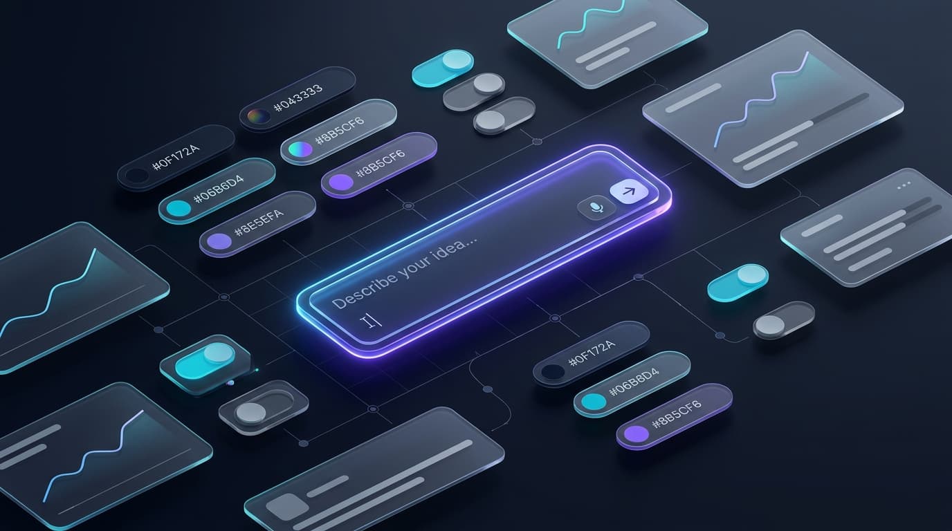
Design Systems & Starting Points: Leading Frameworks, Architecture, and Adoption Guide
Every growing digital product eventually faces the same friction: inconsistent UI components, duplicated frontend code, disjointed brand touchpoints, and mounting design debt. Designers spend valuable hours redesigning buttons, while engineers rebuild tables and modal dialogues that already exist in three other repositories.
A modern design system solves this by acting as the shared contract between design, engineering, and product. It is far more than a Figma sticker sheet or a component library; it is a living ecosystem of design tokens, reusable UI components, architectural standards, accessibility guidelines, and documentation.
If you are looking to build or evolve a design system, you do not have to reinvent the wheel. The industry's top tech leaders have invested hundreds of millions of dollars into battle-testing design systems at scale. By understanding their architecture, strengths, and trade-offs, you can pick the ideal starting point for your team.
Here is an in-depth breakdown of the leading design systems and tooling platforms, complete with their features, benefits, and specific recommendations on when to use or avoid them.
---
1. IBM Carbon Design System
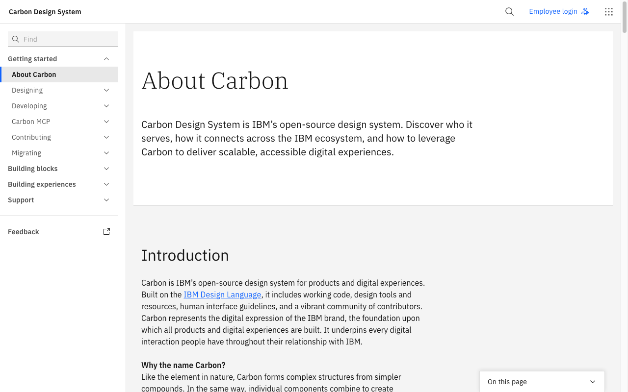
IBM Carbon Design System is IBM's open-source design system for digital products and digital experiences. Engineered from the ground up to support complex enterprise applications, cloud infrastructure dashboards, and global enterprise platforms, Carbon is widely regarded as one of the most mature and disciplined systems in the industry.
Key Features
- Multi-Framework Implementations: Official, production-ready support for React, Web Components, Angular, Svelte, and vanilla JavaScript.
- Enterprise-Grade Data Patterns: Specialised components for complex data tables, filters, batch actions, code snippets, and telemetry visualisations.
- Strict 2x Grid System: A mathematical 8px/4px spatial grid system that governs sizing, typography scale, and layout rhythms.
- Carbon Charts & Data Visualisation: A dedicated library for accessible charts (line, bar, scatter, donut, heatmaps) aligned with Carbon colour tokens.
- WCAG 2.1 AA Compliance: Built-in accessibility standards, contrast checks, and keyboard navigation baked into every component.
Core Benefits
- Exceptional Consistency for Complex Workflows: Handles dense software interfaces, deep multi-level navigation, and multi-tenant admin portals without visual degradation.
- Enterprise Longevity: Maintained continuously by dedicated full-time engineering and design teams at IBM, ensuring reliability and long-term support.
- Cross-Framework Portability: Because Carbon supports Web Components, teams can integrate it across heterogeneous technology stacks without rewriting UI components.
Recommendations on Usage
- Best For: Enterprise SaaS, B2B dashboards, cloud administration consoles, developer tools, and data-dense enterprise applications.
- When to Avoid: Consumer-facing lifestyle apps, highly expressive retail marketing sites, or playful brand experiences where Carbon's rigid, industrial aesthetic feels too severe.
---
2. Google Material 3 (Material You / M3)
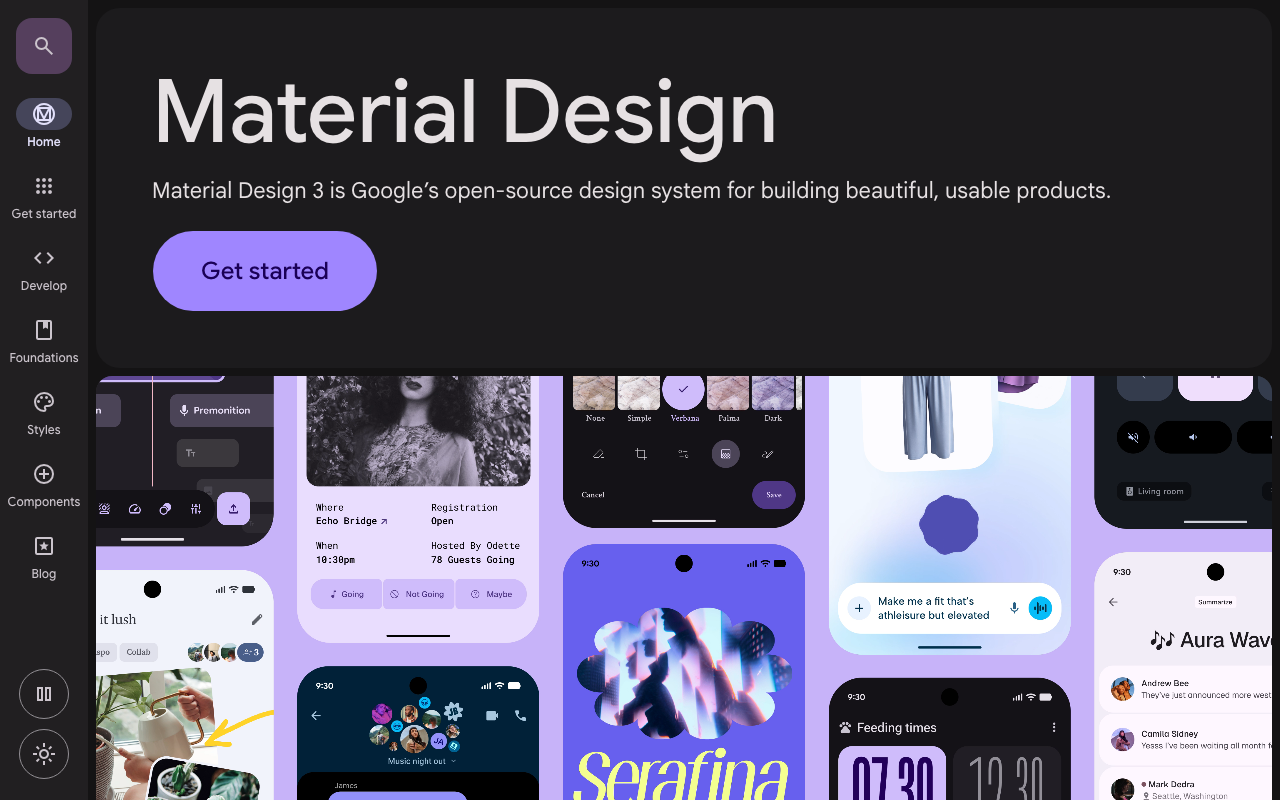
Google Material 3 is the latest evolution of Google's open-source design system. It introduces "Material You", a dynamic design philosophy that adapts colour palettes dynamically based on user wallpapers, device context, and personal preferences, while standardising responsive layouts across mobile, tablet, desktop, and foldable screens.
Key Features
- Dynamic Colour Engine (HCT Color Space): Generates accessible, harmonious tonal palettes on the fly based on a single seed colour, maintaining strict contrast ratios across light and dark modes.
- Multi-Platform Support: Native libraries for Android (Jetpack Compose), Web (Material Web Components), Flutter, and iOS.
- Adaptive Breakpoints & Canonical Layouts: Guidance and components designed for fluid adaptation across phone, tablet, foldable, and desktop screen sizes.
- Rich Motion & State Layer Architecture: Standardised motion choreography, physics-based springs, and ripple/state feedback.
Core Benefits
- World-Class Accessibility Automation: The tonal palette system guarantees WCAG contrast ratios algorithmically, eliminating manual colour pairing mistakes.
- Native Android & Cross-Platform Parity: If you are developing with Flutter or Jetpack Compose, Material 3 is the fastest route to high-fidelity, native-feeling interfaces.
- Fluid Multi-Form-Factor UI: Built-in support for sliding panes, navigation rails, and bottom sheets that scale gracefully across screen sizes.
Recommendations on Usage
- Best For: Native mobile apps (Android and cross-platform Flutter), consumer mobile-first web applications, utility tools, and Google ecosystem integrations.
- When to Avoid: Deep B2B enterprise dashboards with high data density (Material's touch targets and generous padding consume significant screen real estate) or products requiring a distinct brand identity that shouldn't look like Google.
---
3. Uber Base Design System (Base Web)
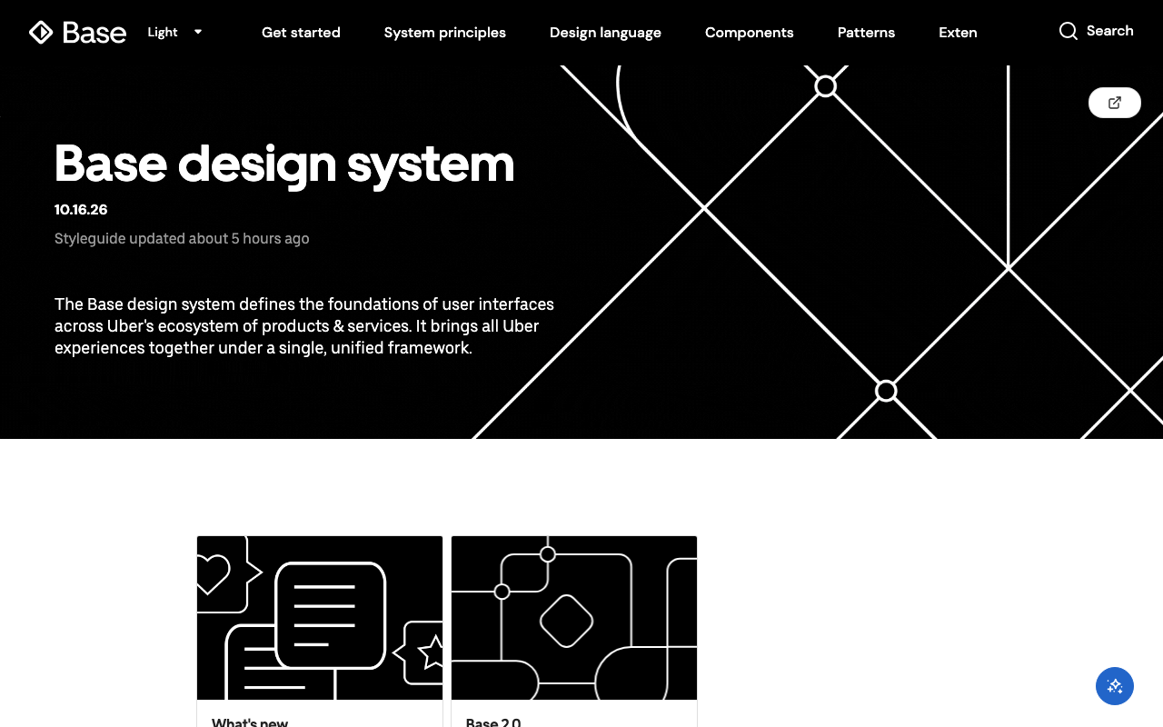
Uber Base Design System is Uber's design and engineering foundation for all web applications across rides, freight, driver portals, and merchant interfaces. Its React implementation, Base Web, is engineered specifically for reliability, rapid development, and strict accessibility.
Key Features
- Extreme Extensibility via Overrides: Base Web's signature feature is its "overrides" pattern, allowing engineers to customise any internal subcomponent, style, or HTML attribute without forking the library.
- Styletron CSS-in-JS Engine: Highly optimised CSS engine providing scoped styling, minimal runtime footprint, and fast rendering.
- Rich High-Level Components: Complex components such as datepickers, multi-select dropdowns, phone input fields, breadcrumbs, and modal drawers.
- Minimalist, High-Contrast Visual Language: Clean typography, sharp contrast borders, and purposeful spacing tuned for high-velocity operational decisions.
Core Benefits
- Zero Style Lock-In: Unlike rigid component libraries, Base's override architecture makes it virtually impossible to hit a customisation dead end.
- Operational Ergonomics: Built for interfaces where users need to make fast decisions under pressure (such as fleet management or logistics dispatch).
- Comprehensive Keyboard Navigation & Screen Reader Support: Accessibility is treated as a first-class citizen across all interactive states.
Recommendations on Usage
- Best For: Operational dashboards, logistics platforms, real-time dispatch systems, booking engines, and React web apps needing robust component primitives with flexible custom styling.
- When to Avoid: Projects using server-rendered styling architectures (e.g., pure Tailwind or Zero-runtime CSS) that do not want to adopt CSS-in-JS tooling.
---
4. Salesforce Lightning Design System 2 (SLDS 2)
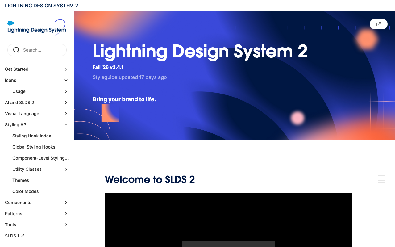
Salesforce Lightning Design System 2 is the unified design framework powering the Salesforce CRM platform, Lightning Web Components (LWC), and enterprise partner applications. SLDS 2 brings modernised CSS architecture, flexible styling hooks, and support for multi-brand enterprise ecosystems.
Key Features
- Design Tokens & Styling Hooks: Built around CSS custom properties (variables) that allow global theme modifications without modifying core markup.
- Framework-Agnostic Blueprint CSS: Provides accessible, structured HTML and CSS patterns that can be used with any JavaScript framework (LWC, React, Vue, Angular).
- Enterprise CRM Patterns: Comprehensive component layouts for customer timelines, record detail views, activity feeds, path wizards, and split-view master-detail layouts.
- Global Accessibility Standards: In-depth guidance for assistive technologies, focus trapping, and enterprise accessibility workflows.
Core Benefits
- Seamless Salesforce Ecosystem Integration: If you build AppExchange applications or customise Salesforce experiences, SLDS is required to maintain native look and feel.
- CSS Architecture Separation: Separates structural markup from stylistic themes, making global brand rebranding and dark mode implementations straightforward.
- Tested with Millions of Business Users: Patterns are optimised for high-volume enterprise data entry, record editing, and complex permissions.
Recommendations on Usage
- Best For: Salesforce ecosystem extensions, Lightning Web Components, large-scale enterprise CRM platforms, and corporate business portals.
- When to Avoid: Standalone consumer applications, lightweight landing pages, or rapid prototypes that do not integrate with Salesforce products.
---
5. Shopify Polaris
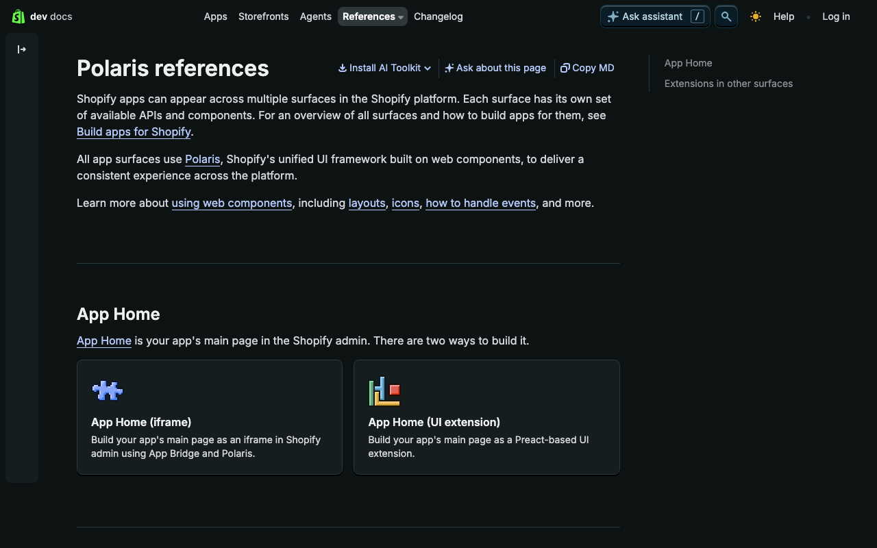
Shopify Polaris is Shopify's design system designed to help merchant-facing apps and administrative experiences feel cohesive, intuitive, and efficient. Polaris is widely celebrated in the design community for having some of the clearest, most actionable content and UX guidelines in existence.
Key Features
- Merchant-Centred UI Library: Specialised components for orders, inventory tables, price inputs, bulk tags, resource lists, and discount workflows.
- Comprehensive Content Guidelines: Deep documentation on UX writing, error messaging, tone of voice, call-to-action phrasing, and merchant communication.
- Polaris React & Polaris Tokens: Tightly coupled React library with comprehensive design tokens for typography, spacing, shadows, and z-indices.
- Responsive Admin Patterns: Optimised for desktop store managers and mobile merchant workflows.
Core Benefits
- Instant Merchant Familiarity: Third-party Shopify apps built with Polaris look and feel indistinguishable from core Shopify admin tools, increasing user trust and adoption.
- Outstanding UX Copywriting Standards: Polaris doesn't just tell you where to place a button; it tells you what words to write on it and how to write clear error messages.
- High Development Velocity: Pre-assembled page layouts, banner alerts, and resource pickers reduce frontend development time significantly.
Recommendations on Usage
- Best For: Shopify apps, e-commerce admin dashboards, merchant portals, billing interfaces, and inventory management systems.
- When to Avoid: Customer-facing online storefronts (Polaris is built for back-office admin tasks, not marketing storefronts) or non-commerce applications with completely different workflow models.
---
6. Supernova.io (Design System Management Platform)
Supernova.io is not a component library itself; it is the industry-leading design system management and documentation platform. Supernova connects design assets in Figma directly to production code repositories, managing design tokens, component documentation, and cross-platform code generation.
Key Features
- Bidirectional Figma & Token Synchronisation: Ingests styles, variables, and components directly from Figma and synchronises them across GitHub, GitLab, and Bitbucket.
- Automated Multi-Platform Code Export: Transforms design tokens into CSS variables, SCSS, Swift, Android XML/Compose, and TypeScript objects automatically via Style Dictionary pipelines.
- Interactive Documentation Engine: A live, customisable documentation portal that embeds interactive React components, Figma frames, markdown, and live storybooks in one central URL.
- Version Control & Release Management: Supports branching, change logs, and semantic versioning for design systems across design and code.
Core Benefits
- Eliminates the Designer-Developer Chasm: When a designer updates a colour token or radius variable in Figma, Supernova can open a pull request with the updated code tokens automatically.
- Single Source of Truth: Houses your component usage guidelines, accessibility dos and don'ts, and live code previews together in an interactive portal.
- Cross-Platform Scalability: Ideal for organisations supporting iOS, Android, and Web simultaneously from a unified design foundation.
Recommendations on Usage
- Best For: Teams that already have Figma designs and code repositories and need a professional pipeline to manage tokens, sync updates, and publish living documentation.
- When to Avoid: Early-stage single-developer projects where manual token syncing is trivial and dedicated documentation tooling adds unnecessary overhead.
---
7. Palantir Blueprint
Palantir Blueprint (developed as Blueprint.js) is Palantir's open-source design system and UI toolkit optimised for building complex, data-dense desktop web applications. If your application involves thousands of data points, interactive graphs, log inspectors, or intense analytical workflows, Blueprint is a gold standard.
Key Features
- Built for Data Density: Components are compact, space-efficient, and optimised for high-resolution desktop monitors and multi-window analytics.
- Advanced Table & Data Grid (`@blueprintjs/table`): High-performance virtualised table supporting millions of cells, column reordering, frozen panes, inline editing, and formula entry.
- Extensive Icon Library: Over 500 purpose-built technical icons available in multiple pixel sizes (16px and 20px).
- TypeScript First: Engineered entirely in TypeScript with strict typing across all components, props, and event handlers.
- Specialised Overlays & Popovers: Sophisticated positioning engines for context menus, complex tooltips, command palettes (Omnibar), and nested popovers.
Core Benefits
- Unrivalled Desktop Productivity: Maximises information throughput for analysts, engineers, and financial traders who need to monitor hundreds of metrics without excessive whitespace.
- Virtualisation Performance: Renders massive data structures and audit logs smoothly without browser freeze.
- Mature TypeScript Architecture: Highly predictable API contracts that integrate seamlessly into enterprise TypeScript codebases.
Recommendations on Usage
- Best For: Data science platforms, cybersecurity consoles, financial modelling tools, healthcare analytics, and desktop-first administrative tools.
- When to Avoid: Mobile web apps (Blueprint is explicitly not designed for mobile touch interfaces) or public-facing marketing websites.
---
8. Other Essential Design Systems Worth Referencing
Beyond the platforms listed above, several other systems represent vital design and technical benchmarks:
Atlassian Design System
- Focus: Productivity, team collaboration, and workflow management (Jira, Confluence, Trello).
- Key Advantage: Masterclass in cognitive ergonomics, form usability, inline status lozenges, and asynchronous feedback banners.
- Best For: Collaborative software, project management tools, and issue tracking platforms.
GitHub Primer
- Focus: Developer platforms, source code review, and repository management.
- Key Advantage: Industry-standard dark mode handling, octicons, and dual implementations in both React and Rails ViewComponents.
- Best For: Developer tools, DevOps dashboards, open-source communities, and code navigation interfaces.
shadcn/ui & Radix UI
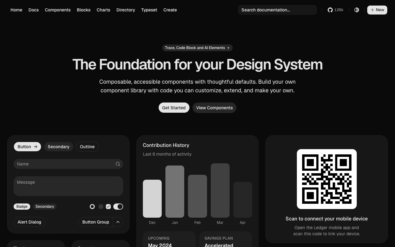
- Focus: Composable, headless, copy-paste React components styled with Tailwind CSS.
- Key Advantage: You own the code. Instead of importing an immutable npm package, components live directly in your codebase, giving you 100% control over customisation and zero vendor lock-in.
- Best For: Modern Next.js and React applications, startup MVPs, and design systems that prioritise custom aesthetics with zero friction.
Ant Design (AntD)
- Focus: Global enterprise applications and internal B2B dashboards.
- Key Advantage: The most extensive component inventory in the React ecosystem, featuring ready-made cascading dropdowns, transfer boxes, and editable data matrices.
- Best For: Large-scale internal company tools, back-office administration, and rapid enterprise prototyping.
Microsoft Fluent 2
- Focus: Unified cross-platform experiences across Windows, Web, macOS, iOS, and Android.
- Key Advantage: Subtle lighting, depth, soft rounded corners, and native platform integration that aligns with Microsoft 365 and Windows 11.
- Best For: Cross-platform enterprise productivity software and Microsoft Teams ecosystem integrations.
---
9. AI UI Elements: Why Design Systems are the Secret Weapon for AI-Native Products
As AI becomes a foundational feature across web and mobile applications, product teams are realising that standard form controls and navigation patterns are no longer enough. AI experiences demand a completely new taxonomy of user interface elements.
Without a design system, teams invariably fall into the "generic chat wrapper" trap—slapping together a raw textarea and grey message bubbles that look identical to every basic ChatGPT clone on the market.
By leveraging an established design system as your starting foundation, you accomplish two critical goals:
1. Accelerate Development Workflow: You don't waste engineering sprints building focus rings, auto-expanding textareas, accessible dropdowns, or tooltip positioners from scratch.
2. Craft a Distinct, Individual Brand Look: You compose AI-native components using your brand's semantic tokens (bespoke typography, custom surface elevations, branded focus states, and tailored micro-interactions), creating an experience that feels uniquely yours.
Common AI UI Elements Every Modern Design System Needs
- Auto-Expanding Prompt Inputs: Multi-line inputs that dynamically grow with user typing, supporting token counter chips, media/document upload pills, voice-to-text triggers, and cancel/generate action buttons.
- Agentic Status & "Thinking" Accordions: Collapsible disclosure components that display chain-of-thought reasoning, background tool calls, web-browsing progress, and API query states without cluttering the main conversation stream.
- Streaming Response Containers: Typographic layouts optimised for live token streams, skeleton loading states, and cursor pulses that prevent layout shift as text streams in.
- Source Grounding & Citation Chips: Interactive badges and inline popovers that cite source documents, display confidence scores, and link directly to underlying reference data.
- Inline Generative UI Widgets: Dynamic, server-driven component rendering where the AI doesn't just return plain text, but renders interactive UI cards—such as editable product configuration forms, real-time analytics charts, calendar booking pickers, or confirmation triggers.
- Message Action Toolbars: Micro-action clusters attached to assistant messages, including quick copy, thumbs up/down evaluation, prompt remixing, version branching (`< 1 of 3 >`), and regeneration triggers.
- Safety Disclaimers & Confidence Badges: Subtle, accessible banner components communicating system boundaries, hallucination warnings, and model guardrails without causing alarm fatigue.
When these AI patterns are built atop a modular design system (like Carbon, Base, or shadcn primitives with Supernova tokens), adding an AI assistant or copilot to an existing platform takes days instead of quarters—while maintaining pixel-perfect fidelity to your core brand.
---
10. Choosing Your Starting Point: The 4 Strategic Approaches
When teams decide to implement a design system, they usually make one of two mistakes: they either try to build everything from scratch (wasting months on accessible button states and focus rings), or they adopt a rigid monolithic library that cannot be customised to match their brand.
Here are the 4 proven starting archetypes to evaluate:
Approach A: Adopt a Turnkey Enterprise System
- Examples: IBM Carbon, Ant Design, Material 3.
- How It Works: Install the libraries, configure the theme variables, and follow their established design guidelines.
- Ideal For: Teams that need to ship complex enterprise software immediately and have limited dedicated design resources.
Approach B: Headless Primitives + Tailwind CSS
- Examples: Radix UI Primitives, shadcn/ui, React Aria.
- How It Works: Use unstyled, accessible primitives that handle keyboard focus, ARIA tags, and screen readers, while applying your own styling via Tailwind or CSS modules.
- Ideal For: Teams with strong brand identity requirements who want complete code ownership and zero component-level baggage.
Approach C: The Token-First Workflow
- Examples: Figma Variables -> Tokens Studio / Supernova -> Style Dictionary -> Any Frontend.
- How It Works: Define design tokens (colours, typography, spacing, shadows) in Figma and publish them to code via an automated pipeline, applying those tokens across existing components.
- Ideal For: Multi-brand companies or multi-platform teams (Web, iOS, Android) that need to maintain design consistency across disparate tech stacks.
Approach D: The Workflow-Specialised Adoption
- Examples: Shopify Polaris for commerce; Palantir Blueprint for analytics.
- How It Works: Adopt a system whose UX patterns already mirror the exact domain model your users expect.
- Ideal For: Niche products where domain conventions (like shopping carts or big data grids) are already perfected by an industry leader.
---
5-Step Roadmap to Roll Out Your Design System
If you are starting today, here is the recommended sequence of execution:
1. Conduct a UI Inventory: Screenshot every button, input, modal, and colour variation currently in production. Group them together. The sheer visual redundancy is the best business case for leadership buy-in.
2. Establish Semantic Design Tokens: Never hardcode hex colours or pixel sizes. Establish a 3-tier token hierarchy:
- Global Tokens: `blue-500: #0062FF`
- Semantic Tokens: `color-action-primary: {blue-500}`
- Component Tokens: `button-primary-bg: {color-action-primary}`
3. Select Your Component Foundation: Decide whether you are adopting an existing system like Carbon or building a headless stack using Radix/shadcn. Avoid writing low-level accessible primitives (select dropdowns, comboboxes, datepickers) from scratch.
4. Build Core Atomic Primitives First: Focus on the top 10 components that cover 80% of your screens: Button, Input, Select, Checkbox, Modal, Card, Typography, Badge, Alert, and Table.
5. Implement Governance & Living Documentation: Connect your repository to a documentation tool like Supernova, Storybook, or a dedicated docs portal. A design system that is not documented is a design system that will not be used.
---
How Spherify Helps
At Spherify, we design and build modern digital products that scale. Whether you need to establish a design token architecture, migrate legacy frontends to a modern headless system, or build a scalable component library for your team, we connect strategy, design, and modern web engineering.
Looking to streamline your product's design and frontend architecture? Get in touch with our team in Cleveland, QLD, and let's build something exceptional together.